TripMaster
Solo UX Project
Tools: Figma, FigJam, Procreate (for user flow)
Timeline: September 2024 to October 2024
TripMaster is a desktop travel planning tool designed for users with anxiety. Many travel websites require users to juggle separate platforms for mapping, booking, and organizing — and that burden can intensify anxiety. TripMaster simplifies the process by integrating these tools into one supportive, efficient system.
The Problem
Unfortunately, we live in a world that is not accommodated to people struggling with mental health issues. Anxiety is one of them; it can tremendously impact one’s daily life, possibly omitting the simple pleasures of life experiences. Traveling can provoke symptoms of anxiety regardless of how often that person has traveled, which can make them not want to travel anymore because of the invisible labor that anxious individuals face. Luckily, TripMaster was made to make the invisible visible. By combining note-taking, mapping, and booking, TripMaster is the one-stop shop travel site that accommodates the needs of people with anxiety. So I asked the question: How might we help eliminate the workload of research and planing for people with anxiety, so that they could have more enjoyable trips?
Research
I conducted user interviews and competitor analysis to understand the current landscape.
Key Findings:
Users with anxiety struggle to enjoy travel due to stress around decision-making and research.
They often use multiple apps (Notion, Google Maps, flight websites) to organize plans.
Most users prefer desktop interfaces for multitasking and data input.
Common triggers include: last-minute changes, unorganized plans, and hidden costs.
Competitive Insights:
Trip.com and TripAdvisor offer comprehensive features, but lack emotional UX.
Skyscanner offers price comparison but not itinerary integration.
Notion and Google Maps are frequently used together but not linked.
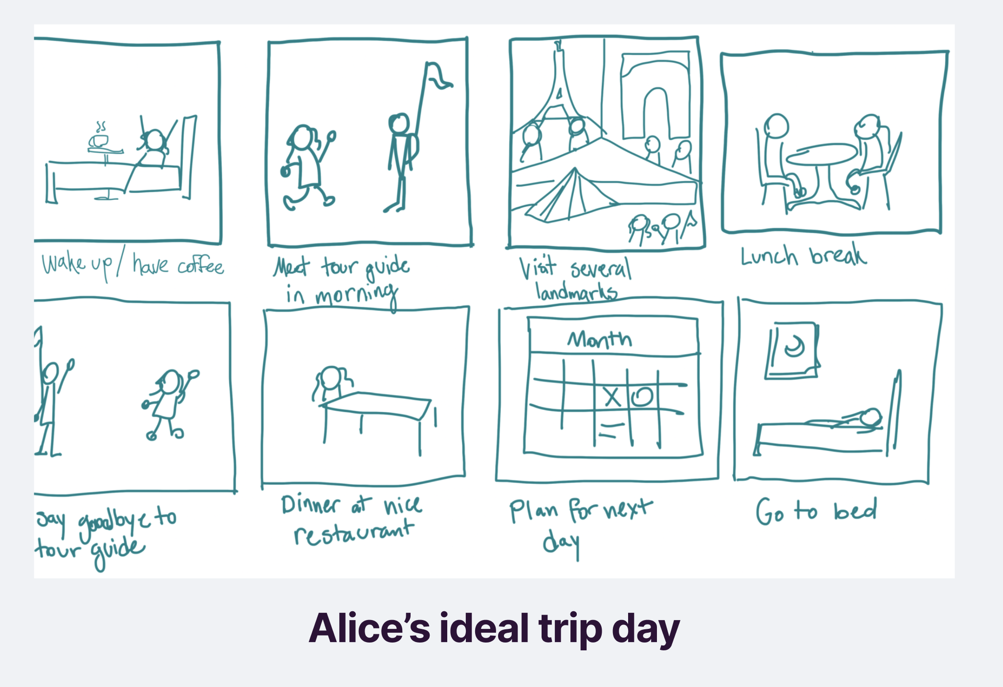
User Persona

ALICE - 19 Y.O. FULL-TIME STUDENT
PAIN POINTS:
- Easily overwhelmed by trip planning details.
- Feels guilty about spending or missing out.
- Struggles to balance planning with enjoying the moment.
NEEDS:
- One place to plan, compare, and book trips.
- A visual system that reduces decision fatigue.
- Gentle structure without pressure.
Solution Ideation
We focused on eliminating friction in the travel planning process while empowering anxious users with structure and control.
Price Comparison Panel: lets users compare flight, hotel, and car prices on one screen
Integrated Calendar: bookings automatically appear on a timeline
Route Builder: helps users visualize their journey clearly with maps and time blocks
Trip Notes: allows users to save important links, to-dos, or backup options
User Flow
Design Systems


User Testing
I ran 3 task-based user tests with classmates and prototyped users.
Tasks:
Book a trip and view options
Add a note to an itinerary
Navigate between calendar and route builder
Key Insights:
All users appreciated the centralization of tools
Some wanted clearer icons and labels (which we adjusted)
Route Builder was a standout feature, especially for visual thinkers
Iterations:
Improved label hierarchy in the sidebar
Added tooltips to icons for first-time users
Enhanced spacing and contrast in the Calendar view